

2025
The Wonderful Wizard of Oz
A drop cap design to be accompanied by L. Frank Baum's The Wonderful Wizard of Oz.
Graphic Design
Illustration
Problem
L. Frank Baum's The Wonderful Wizard of Oz need no introduction. From its timeless story to its iconic characters, it was important to capture the integrities of his vision through a drop cap design.
A story for all ages.
The practice of drop caps have historically been around for thousands of years. By simply integrating a large letter mark to signal the beginning of text, an added layer of visual engagement is created for the reader. Following the narrative of Dorothy and her journey to Oz, these drop caps encapsulate the contents of the respective chapters they belong to.

Concept
Designed without limitations.
While the book’s imagery has had various interpretations, most famously from illustrations done by W. W. Denslow and the 1939 film starring Judy Garland, reimagining the characters was a feat that could break the limitations of what could be achieved. Following the narrative, each drop cap represents a puzzle piece to the bigger picture, serving as a guide to readers as they continue on.


Design System
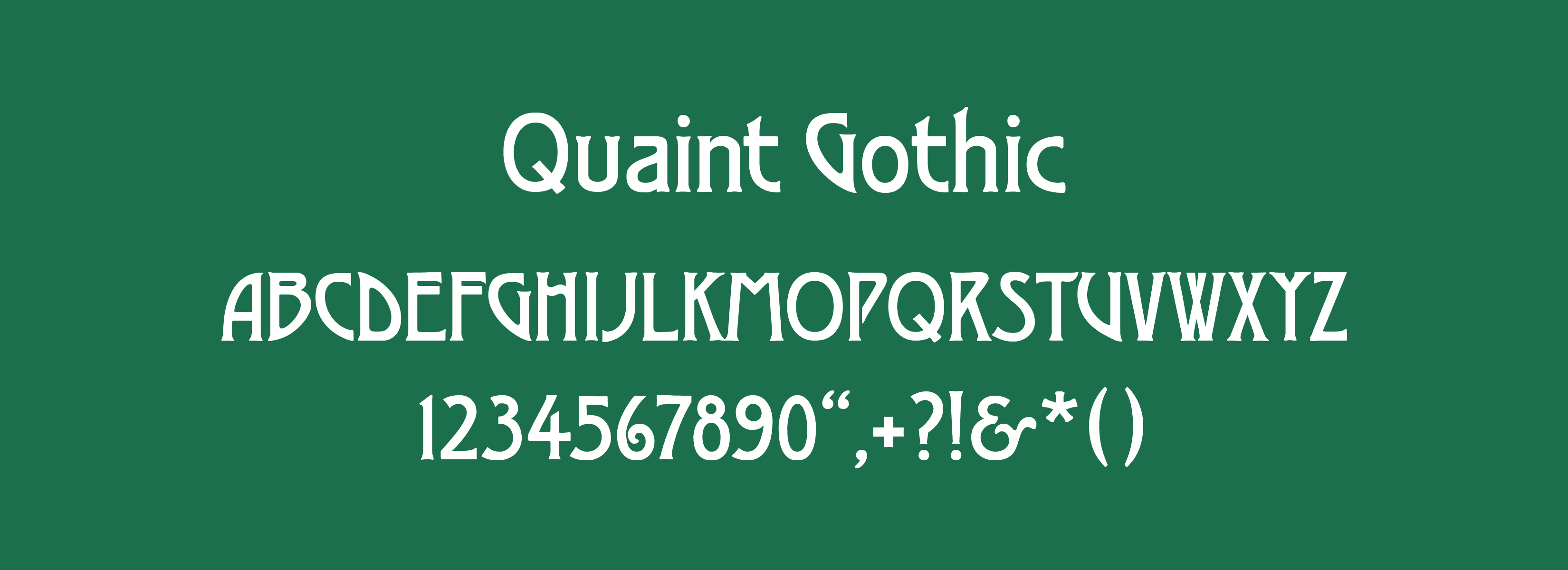

Adhering to the book's publication date of 1900, the typeface treatment is a reflection of common letterings popularized during that period. Elegant curves and slightly pronounced serifs are just some of the features that embodied the change that the turn of the 18th century brought to the collective society. To accommodate for the intertwined illustrations, the typeface was slightly manipulated to allot for more room to design with. Letters like the D were changed to increase counter space, while the W and E had similar treatments by reducing stem and stroke widths, respectively.

Solution
The art of antiquity.
By adopting a monochromatic treatment to the final drop caps, a consistent style was established to bring unison to the letters. Each drop cap incorporates a character in addition to a secondary element that builds another layer of dimension. Through the selection of an appropriate typeface accompanied by a stylistic illustration treatment, the final designs embody a timelessness that exists within a story like The Wonderful Wizard of Oz.

More Works
©2026


2025
The Wonderful Wizard of Oz
A drop cap design to be accompanied by L. Frank Baum's The Wonderful Wizard of Oz.
Graphic Design
Illustration
Problem
L. Frank Baum's The Wonderful Wizard of Oz need no introduction. From its timeless story to its iconic characters, it was important to capture the integrities of his vision through a drop cap design.
A story for all ages.
The practice of drop caps have historically been around for thousands of years. By simply integrating a large letter mark to signal the beginning of text, an added layer of visual engagement is created for the reader. Following the narrative of Dorothy and her journey to Oz, these drop caps encapsulate the contents of the respective chapters they belong to.

Concept
Designed without limitations.
While the book’s imagery has had various interpretations, most famously from illustrations done by W. W. Denslow and the 1939 film starring Judy Garland, reimagining the characters was a feat that could break the limitations of what could be achieved. Following the narrative, each drop cap represents a puzzle piece to the bigger picture, serving as a guide to readers as they continue on.


Design System


Adhering to the book's publication date of 1900, the typeface treatment is a reflection of common letterings popularized during that period. Elegant curves and slightly pronounced serifs are just some of the features that embodied the change that the turn of the 18th century brought to the collective society. To accommodate for the intertwined illustrations, the typeface was slightly manipulated to allot for more room to design with. Letters like the D were changed to increase counter space, while the W and E had similar treatments by reducing stem and stroke widths, respectively.

Solution
The art of antiquity.
By adopting a monochromatic treatment to the final drop caps, a consistent style was established to bring unison to the letters. Each drop cap incorporates a character in addition to a secondary element that builds another layer of dimension. Through the selection of an appropriate typeface accompanied by a stylistic illustration treatment, the final designs embody a timelessness that exists within a story like The Wonderful Wizard of Oz.

More Works
©2026


2025
The Wonderful Wizard of Oz
A drop cap design to be accompanied by L. Frank Baum's The Wonderful Wizard of Oz.
Graphic Design
Illustration
Problem
L. Frank Baum's The Wonderful Wizard of Oz need no introduction. From its timeless story to its iconic characters, it was important to capture the integrities of his vision through a drop cap design.
A story for all ages.
The practice of drop caps have historically been around for thousands of years. By simply integrating a large letter mark to signal the beginning of text, an added layer of visual engagement is created for the reader. Following the narrative of Dorothy and her journey to Oz, these drop caps encapsulate the contents of the respective chapters they belong to.

Concept
Designed without limitations.
While the book’s imagery has had various interpretations, most famously from illustrations done by W. W. Denslow and the 1939 film starring Judy Garland, reimagining the characters was a feat that could break the limitations of what could be achieved. Following the narrative, each drop cap represents a puzzle piece to the bigger picture, serving as a guide to readers as they continue on.


Design System


Adhering to the book's publication date of 1900, the typeface treatment is a reflection of common letterings popularized during that period. Elegant curves and slightly pronounced serifs are just some of the features that embodied the change that the turn of the 18th century brought to the collective society. To accommodate for the intertwined illustrations, the typeface was slightly manipulated to allot for more room to design with. Letters like the D were changed to increase counter space, while the W and E had similar treatments by reducing stem and stroke widths, respectively.

Solution
The art of antiquity.
By adopting a monochromatic treatment to the final drop caps, a consistent style was established to bring unison to the letters. Each drop cap incorporates a character in addition to a secondary element that builds another layer of dimension. Through the selection of an appropriate typeface accompanied by a stylistic illustration treatment, the final designs embody a timelessness that exists within a story like The Wonderful Wizard of Oz.

More Works
©2026

