
2025
National Geographic
A three-spread zine project supported by an event poster driven by the National Geographic brand.
Layout Design
Typography
Problem
Inspired by the National Geographic® branding, this zine project communicates an exhibition event in conjunction with the American Museum of National History.
A deadly touch.
For this assignment, we were presented with one of the five senses to be explored in a more abstract manner. Driven by a concept that was primarily nature-driven, the sense of touch was selected in relation to the way different animals interact with one another. From this, three deliverables were required: a three-spread zine layout including a front and back cover, a poster promoting a related event, and a motion graphic animation to help support it.

Concept
Strike!
In the wild, there exists many ways in which animals express a sense of touch with each other. While the concept of symbiosis had enough material to easily deliver three of the necessary deliverables, the concept of a "deadly touch" felt like a stronger direction in regards to visual material. Taking inspiration from nature documentaries and the National Geographic® branding, a large body of text was initially drafted that delved into the defense mechanisms that certain creatures utilized when disturbed.


Design System
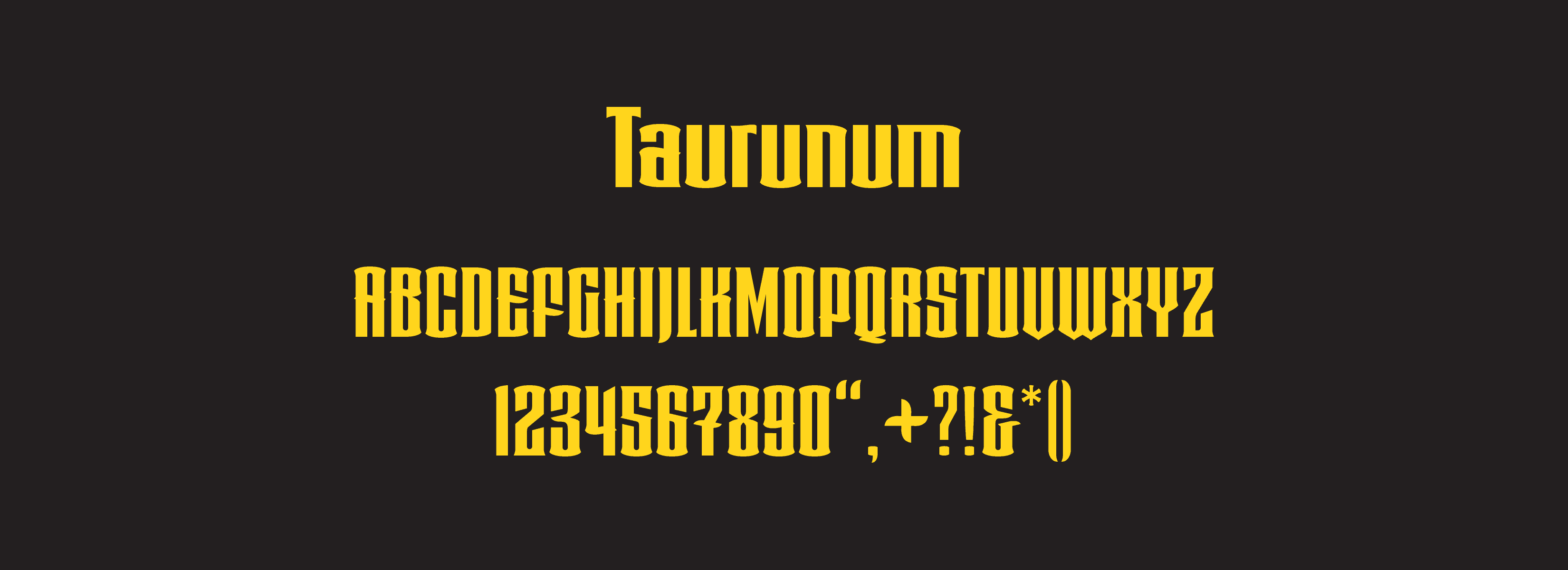
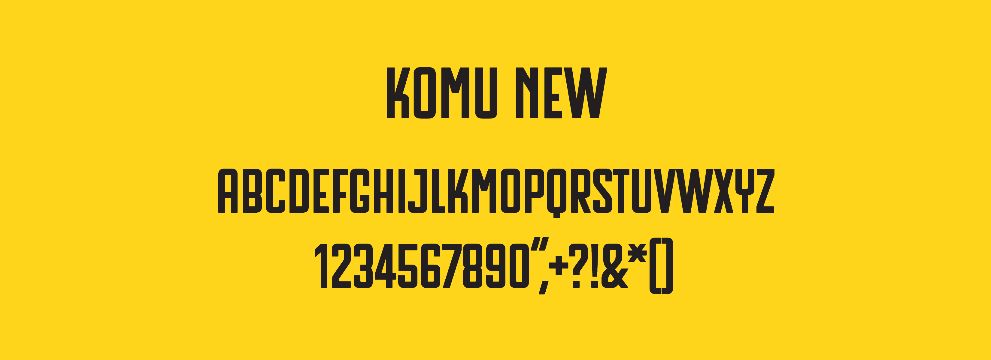
The typeface treatment leaned into sans-serif letterforms to elicit a contemporary feel. For the main "Strike!" title, a typeface with very nuanced serifs was selected, mimicking fangs similar to that of a snake. While typical National Geographic® editorial layouts implement serif body text, it was interesting to create a design that deviated from pure reference and explored a new style. In turn, the final product managed to still keep the integrities of the brand yet present itself in a refreshed way that could be seen as a modernized interpretation.

Solution
Float like a butterfly, sting like a bee.
With the selected sense of touch being the focal point of the subject matter and treatment, designing the contents heavily relied on imagery to convey its message. While every spread relied on a grid system to establish the base foundation, certain elements were allowed to break out to express a more organic feeling to the design. Maintaining the National Geographic® identity was a necessary consideration that often altered stylistic choices. The infamous yellow shade appears all throughout the designs, constantly referencing the National Geographic® brand to the viewers.

More Works
©2026


2025
National Geographic
A three-spread zine project supported by an event poster driven by the National Geographic brand.
Layout Design
Typography
Problem
Inspired by the National Geographic® branding, this zine project communicates an exhibition event in conjunction with the American Museum of National History.
A deadly touch.
For this assignment, we were presented with one of the five senses to be explored in a more abstract manner. Driven by a concept that was primarily nature-driven, the sense of touch was selected in relation to the way different animals interact with one another. From this, three deliverables were required: a three-spread zine layout including a front and back cover, a poster promoting a related event, and a motion graphic animation to help support it.
Concept
Strike!
In the wild, there exists many ways in which animals express a sense of touch with each other. While the concept of symbiosis had enough material to easily deliver three of the necessary deliverables, the concept of a "deadly touch" felt like a stronger direction in regards to visual material. Taking inspiration from nature documentaries and the National Geographic® branding, a large body of text was initially drafted that delved into the defense mechanisms that certain creatures utilized when disturbed.
Design System
The typeface treatment leaned into sans-serif letterforms to elicit a contemporary feel. For the main "Strike!" title, a typeface with very nuanced serifs was selected, mimicking fangs similar to that of a snake. While typical National Geographic® editorial layouts implement serif body text, it was interesting to create a design that deviated from pure reference and explored a new style. In turn, the final product managed to still keep the integrities of the brand yet present itself in a refreshed way that could be seen as a modernized interpretation.
Solution
Float like a butterfly, sting like a bee.
With the selected sense of touch being the focal point of the subject matter and treatment, designing the contents heavily relied on imagery to convey its message. While every spread relied on a grid system to establish the base foundation, certain elements were allowed to break out to express a more organic feeling to the design. Maintaining the National Geographic® identity was a necessary consideration that often altered stylistic choices. The infamous yellow shade appears all throughout the designs, constantly referencing the National Geographic® brand to the viewers.
More Works
©2026