
2025
Noirceur
Brand identity and packaging design for a series of chocolate bars.
Branding
Packaging Design
Problem
Noirceur is a chocolate brand designed with change in mind. Utilizing intuitive farm mapping, efforts aim towards a deforestation-free cocoa supply chain in the near future.
Chocolate for change.
The chocolate industry is a multi-billion dollar global market comprised of large corporations and smaller artisans alike. As consumers have evolved to better understand sustainability and fair trade, such factors have become table-stake features that cannot be ignored. Through the inception of Noirceur, there exists a bridge between both playful design and committed social responsibility. Built upon ethical sourcing and forestland preservation, the brand seeks to elicit lasting change to the cocoa industry.

Concept
A wicked design.
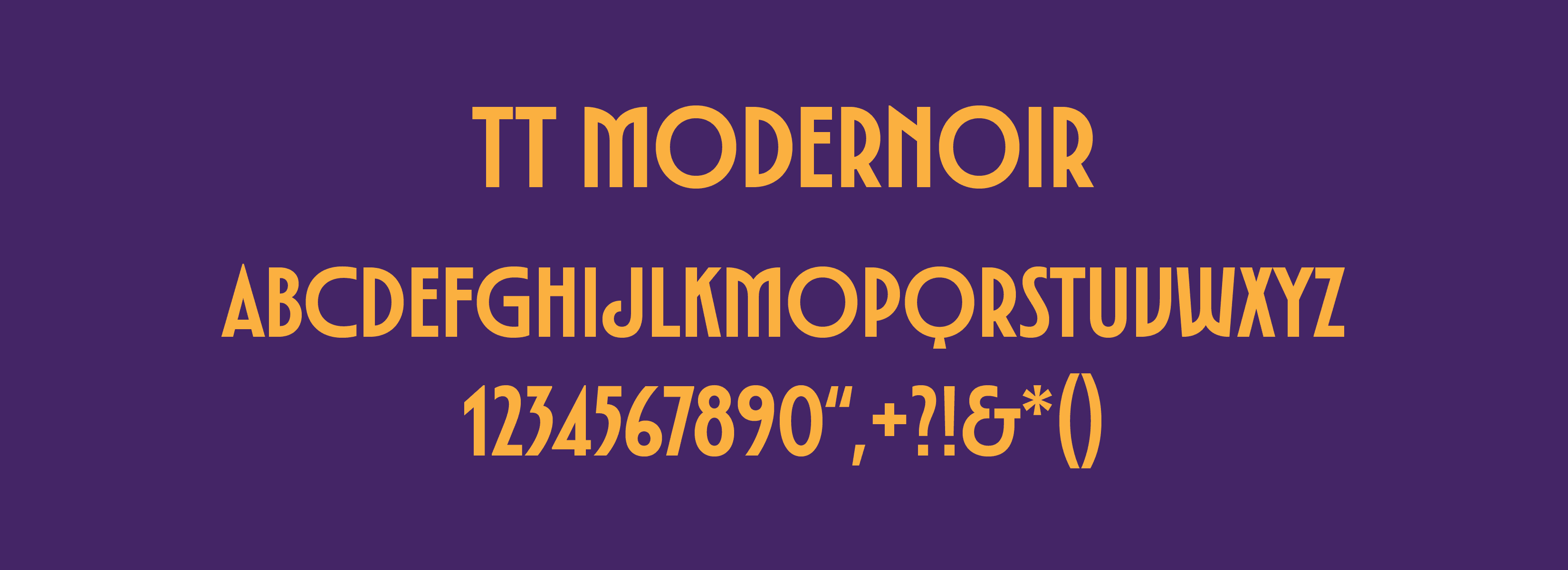
The art of the chocolate bar goes far beyond simply indulgence. In a ever changing market that often overwhelms the consumer with the option of choice, visual imagery wields an important factor in a successful product. Through research and auditing, an anomaly was determined: bring back fun packaging. Aimed towards Generation-Z, the designs had to embody both the future and the past, a characteristic that hallmarks what Gen-Z is all about. Bold in imagery yet sophisticated in execution, the treatment heavily referenced the Art Deco movement, a period notorious for honoring tradition but championing innovation.


Identity System
The French word "noirceur" roughly translates to darkness in English. From this, a concept of a dark cocoa flavor profile was developed, as well as a complimentary package treatment that alludes to Halloween and the "darkness." Building upon nostalgia and notoriety, the designs reflect three iconic Halloween archetypes: the vampire, the witch, and the monster.

Solution
A ghoulish touch in every bite.
Creating three chocolate bars separated by a unique flavor profile required using color to express individuality. With each character possessing their own history and background, the process became much simpler to find correlations between the two. Using red for the vampire and green for the monster tapped into recognizable cues that the general market would already have, therefore, allowing flavors like cherry and pistachio to be strong contenders when it came to the final decision.

More Works
©2026


2025
Noirceur
Brand identity and packaging design for a series of chocolate bars.
Branding
Packaging Design
Problem
Noirceur is a chocolate brand designed with change in mind. Utilizing intuitive farm mapping, efforts aim towards a deforestation-free cocoa supply chain in the near future.
Chocolate for change.
The chocolate industry is a multi-billion dollar global market comprised of large corporations and smaller artisans alike. As consumers have evolved to better understand sustainability and fair trade, such factors have become table-stake features that cannot be ignored. Through the inception of Noirceur, there exists a bridge between both playful design and committed social responsibility. Built upon ethical sourcing and forestland preservation, the brand seeks to elicit lasting change to the cocoa industry.
Concept
A wicked design.
The art of the chocolate bar goes far beyond simply indulgence. In a ever changing market that often overwhelms the consumer with the option of choice, visual imagery wields an important factor in a successful product. Through research and auditing, an anomaly was determined: bring back fun packaging. Aimed towards Generation-Z, the designs had to embody both the future and the past, a characteristic that hallmarks what Gen-Z is all about. Bold in imagery yet sophisticated in execution, the treatment heavily referenced the Art Deco movement, a period notorious for honoring tradition but championing innovation.
Identity System
The French word "noirceur" roughly translates to darkness in English. From this, a concept of a dark cocoa flavor profile was developed, as well as a complimentary package treatment that alludes to Halloween and the "darkness." Building upon nostalgia and notoriety, the designs reflect three iconic Halloween archetypes: the vampire, the witch, and the monster.
Solution
A ghoulish touch in every bite.
Creating three chocolate bars separated by a unique flavor profile required using color to express individuality. With each character possessing their own history and background, the process became much simpler to find correlations between the two. Using red for the vampire and green for the monster tapped into recognizable cues that the general market would already have, therefore, allowing flavors like cherry and pistachio to be strong contenders when it came to the final decision.
More Works
©2026