
2025
Stellar
Brand identity and package design specializing in skincare beauty.
Branding
Packaging Design
Problem
Stellar is a cosmological-inspired skincare beauty brand focusing on clean ingredients and ethical sourcing. Designed to reshape the beauty market, Stellar aims to reach for the stars.
A galactic mission.
The personal skincare market has far too long been oversaturated with brands that color inside the lines. From conventional packaging treatments to safe typefaces that cater towards minimalistic aesthetics, it felt necessary to create a design that looked to the future, for the future. The developed skincare line would not only challenge competitors on the market but create a space on shelves that would appeal to the newer Generation Alpha.

Concept
From ground zero and up.
With an abundance of skincare products on the market, it was important to first understand the positioning each brand adopted within their identity. With imagery tying to the universe and nature, keeping Stellar organic-based in its ingredients was something that could enhance the brand's value. Many skincare brands design with a mindful approach to the environment, and Stellar is no different. Sustainable sourcing and cruelty-free testing are just two considerations that reinforces the brand's commitment to design for good.


Identity System
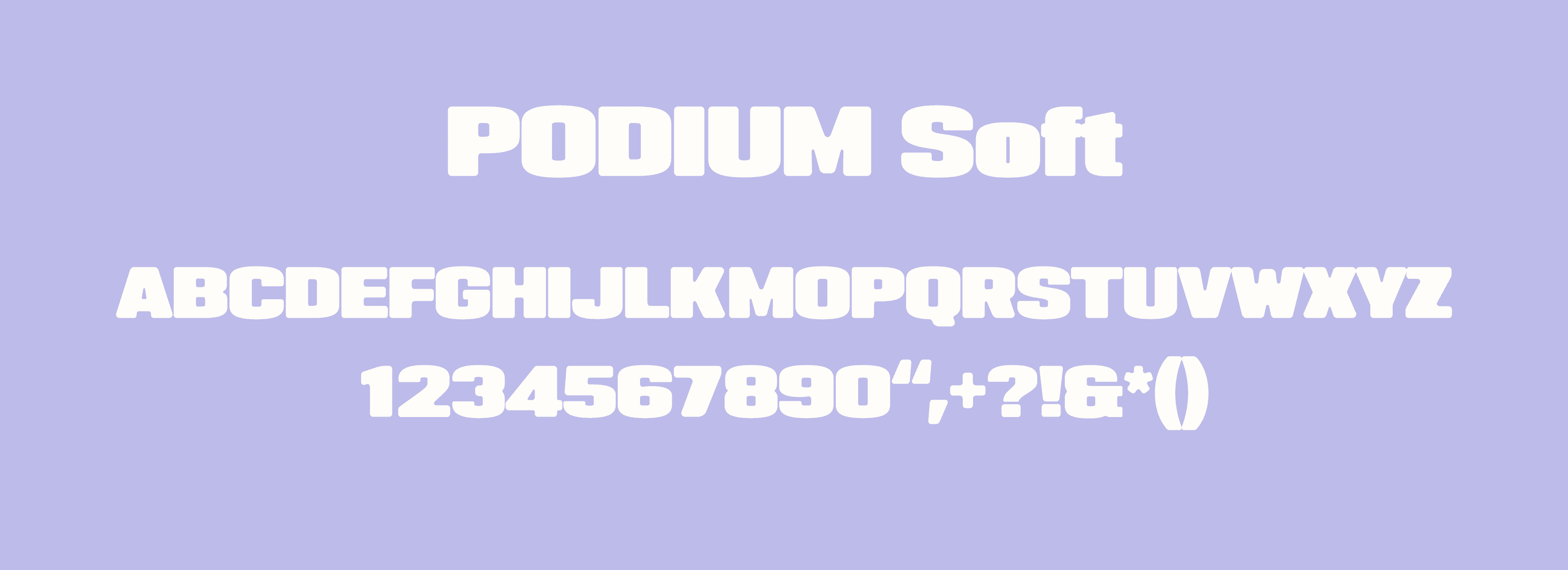
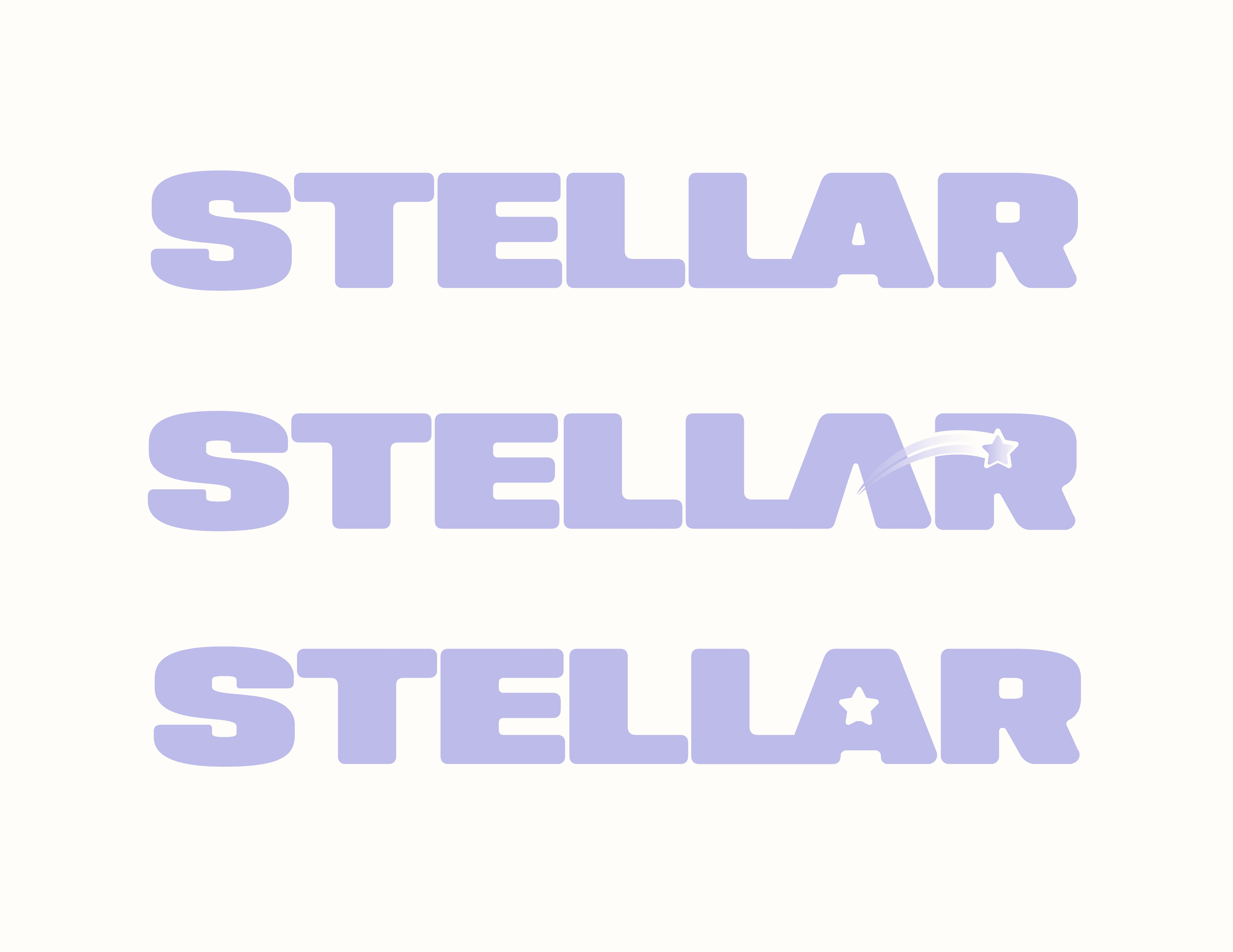
Development of the Stellar identity first began with an exploration of typefaces ranging from conventional to otherworldly. Given the brand's concise name, a typeface like Podium Soft with its large expanded strokes would heavily contrast competitors with logos that opt for a more sleek approach. To connect the logo to the star imagery, further manipulation was conducted to introduce a star shape in the counter of the letterform A.

Solution
Shooting for the stars.
Through retail audit and conductive interviewing, a final design for the Stellar skincare brand was achieved. With its pastel purple color treatment and star-infused elemental touches, the final package reflects a future in skincare that boasts experimentation and fun. While message clarity is a must when designing a consumable product, pairing this with mindful design is what propels a brand to yield both visibility and credibility.

More Works
©2026


2025
Stellar
Brand identity and package design specializing in skincare beauty.
Branding
Packaging Design
Problem
Stellar is a cosmological-inspired skincare beauty brand focusing on clean ingredients and ethical sourcing. Designed to reshape the beauty market, Stellar aims to reach for the stars.
A galactic mission.
The personal skincare market has far too long been oversaturated with brands that color inside the lines. From conventional packaging treatments to safe typefaces that cater towards minimalistic aesthetics, it felt necessary to create a design that looked to the future, for the future. The developed skincare line would not only challenge competitors on the market but create a space on shelves that would appeal to the newer Generation Alpha.
Concept
From ground zero and up.
With an abundance of skincare products on the market, it was important to first understand the positioning each brand adopted within their identity. With imagery tying to the universe and nature, keeping Stellar organic-based in its ingredients was something that could enhance the brand's value. Many skincare brands design with a mindful approach to the environment, and Stellar is no different. Sustainable sourcing and cruelty-free testing are just two considerations that reinforces the brand's commitment to design for good.
Identity System
Development of the Stellar identity first began with an exploration of typefaces ranging from conventional to otherworldly. Given the brand's concise name, a typeface like Podium Soft with its large expanded strokes would heavily contrast competitors with logos that opt for a more sleek approach. To connect the logo to the star imagery, further manipulation was conducted to introduce a star shape in the counter of the letterform A.
Solution
Shooting for the stars.
Through retail audit and conductive interviewing, a final design for the Stellar skincare brand was achieved. With its pastel purple color treatment and star-infused elemental touches, the final package reflects a future in skincare that boasts experimentation and fun. While message clarity is a must when designing a consumable product, pairing this with mindful design is what propels a brand to yield both visibility and credibility.
More Works
©2026