
2025
Nintendo
A bus shelter concept designed following the Nintendo brand identity system.
Spatial Design
Branding
Problem
A 360-degree bus shelter designed with the Nintendo® brand in mind. Following brand history and identity systems, the shelter serves as in integrative means of marketing.
Designed for the player.
Creating a branded bus shelter called for a consideration for both functionality and visual cues. Not only did the brand need to be represented in an obvious manner, a right balance had to be achieved to avoid deviating from the design's main purpose as a waiting area for the public bus. In addition, aspects to be considered was adhering to dimension guidelines of an actual bus shelter as well as an interactive kiosk feature.

Concept
The Nintendo Bus Shelter incorporates both the brand identity system and its original IP to yield a design that is instantly recognized by children and adults alike.
Though Nintendo is a brand fortunate enough to have access to such iconic IP characters, it was important to not stray away from functionality in favor of nostalgia. By establishing the general shape language of a bus shelter first, the design carries all the necessary components to work as intended. From there, slight alterations could be implemented so that its final iteration adopts the right amount of the Nintendo branding.


Design System
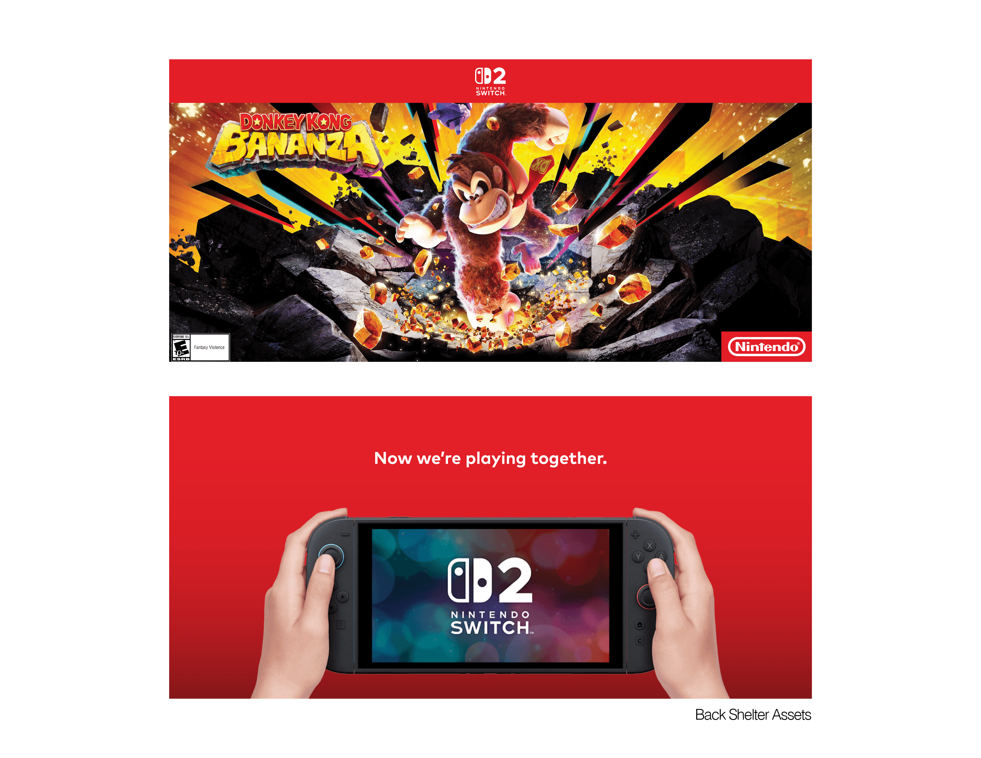
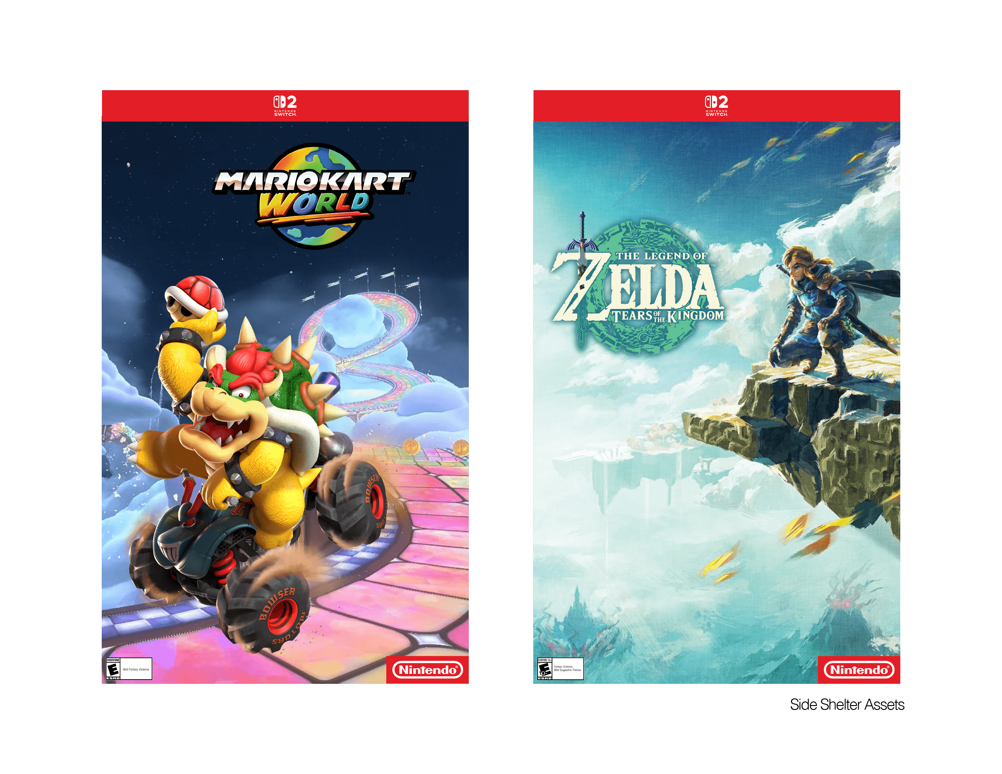
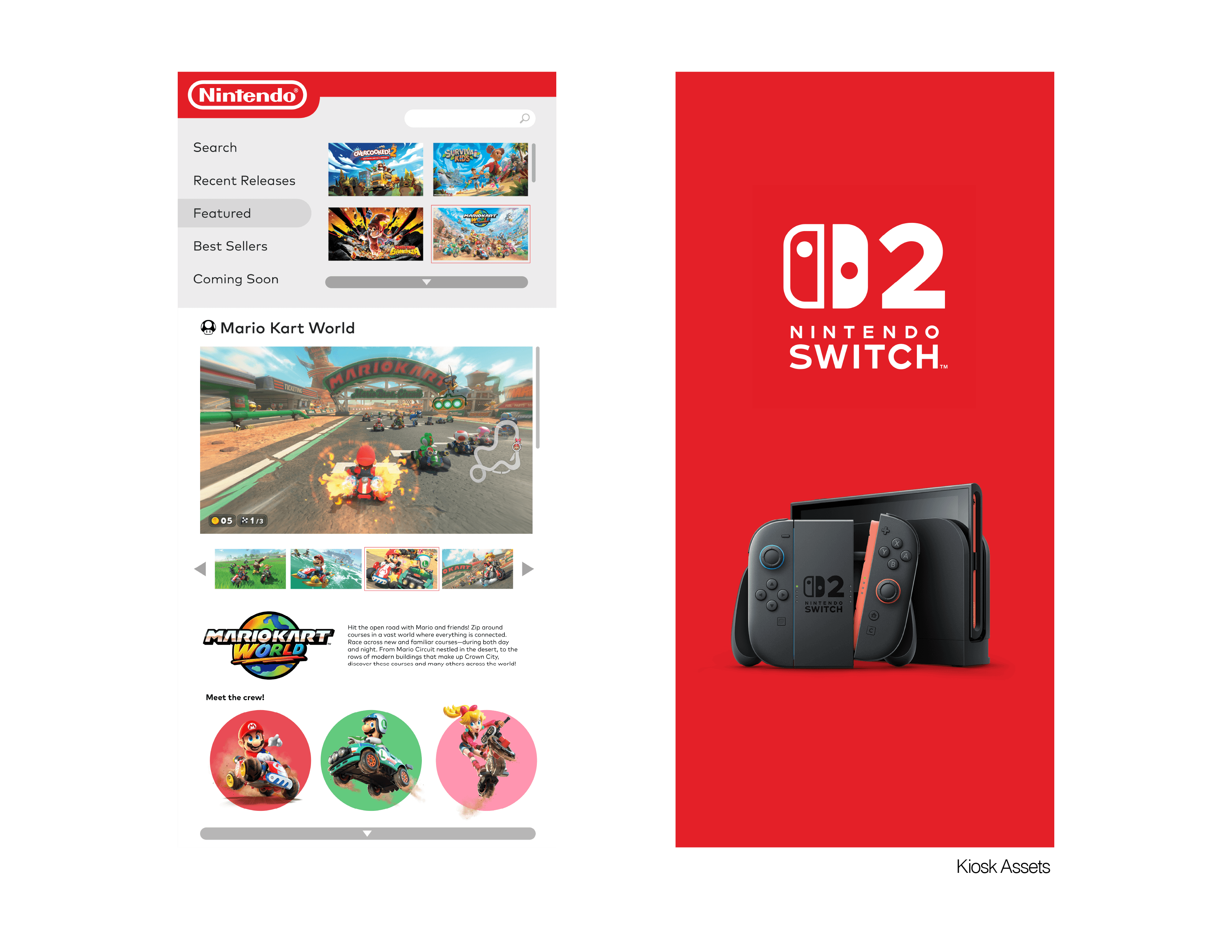
Much of the shelter branding is made possible through designing promotional assets. Introducing imagery of Nintendo characters and the new Switch 2 console system were ways to call back to the brand without having too much direct influence on the actual shelter design. With the kiosk feature, a digital encyclopedia UI was developed so that visitors may explore the selection of Nintendo games available.

Solution
All fun and games.
Designing with branding parameters was such an exciting project to tackle. One of the most important lessons learned through the process was understanding how to convey a brand identity in a manner that felt integrative and natural. While the Nintendo branding had much to work with, it came down to picking and choosing the right components that communicated just enough to be recognized and appreciated.

More Works
©2026


2025
Nintendo
A bus shelter concept designed following the Nintendo brand identity system.
Spatial Design
Branding
Problem
A 360-degree bus shelter designed with the Nintendo® brand in mind. Following brand history and identity systems, the shelter serves as in integrative means of marketing.
Designed for the player.
Creating a branded bus shelter called for a consideration for both functionality and visual cues. Not only did the brand need to be represented in an obvious manner, a right balance had to be achieved to avoid deviating from the design's main purpose as a waiting area for the public bus. In addition, aspects to be considered was adhering to dimension guidelines of an actual bus shelter as well as an interactive kiosk feature.
Concept
The Nintendo Bus Shelter incorporates both the brand identity system and its original IP to yield a design that is instantly recognized by children and adults alike.
Though Nintendo is a brand fortunate enough to have access to such iconic IP characters, it was important to not stray away from functionality in favor of nostalgia. By establishing the general shape language of a bus shelter first, the design carries all the necessary components to work as intended. From there, slight alterations could be implemented so that its final iteration adopts the right amount of the Nintendo branding.
Design System
Much of the shelter branding is made possible through designing promotional assets. Introducing imagery of Nintendo characters and the new Switch 2 console system were ways to call back to the brand without having too much direct influence on the actual shelter design. With the kiosk feature, a digital encyclopedia UI was developed so that visitors may explore the selection of Nintendo games available.
Solution
All fun and games.
Designing with branding parameters was such an exciting project to tackle. One of the most important lessons learned through the process was understanding how to convey a brand identity in a manner that felt integrative and natural. While the Nintendo branding had much to work with, it came down to picking and choosing the right components that communicated just enough to be recognized and appreciated.
More Works
©2026