
2025
The Metropolitan Opera
An event poster design for The Metropolitan Opera.
Layout Design
Illustration
Problem
A combination of typography and complimentary illustrations to create a poster that emphasizes clarity and visual interest.
Bellissimo!
This project serves as an experimental venture in type-based poster design. While visual language is important in capturing the viewer's attention, an added layer of text signals that the poster must also present itself with clarity. To achieve this not only requires a defined grid system but an eye for typographic treatment and text hierarchy.

Concept
The Metropolitan Opera invites audiences to experience eight different opera performances for the 2025-2026 winter and spring season.
To best guide the viewer's eyes towards which aspects of text is most notable, a level of hierarchy must be established. Keeping the design locked in a grid system not only works to organize information, but creates a level of order that allows its contents to be understood. By prioritizing opera and composer titles followed by a brief synopsis and performance dates, the viewer is presented with the choice to further examine the poster contents if interested.


Design System
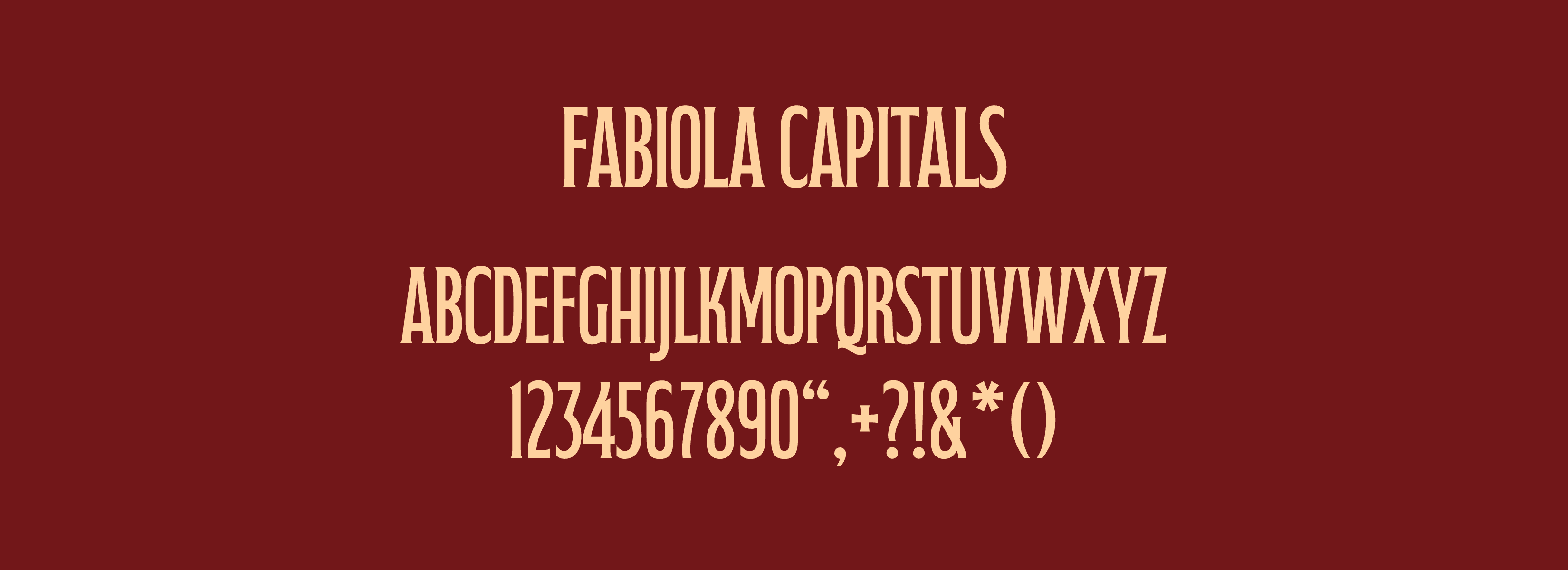
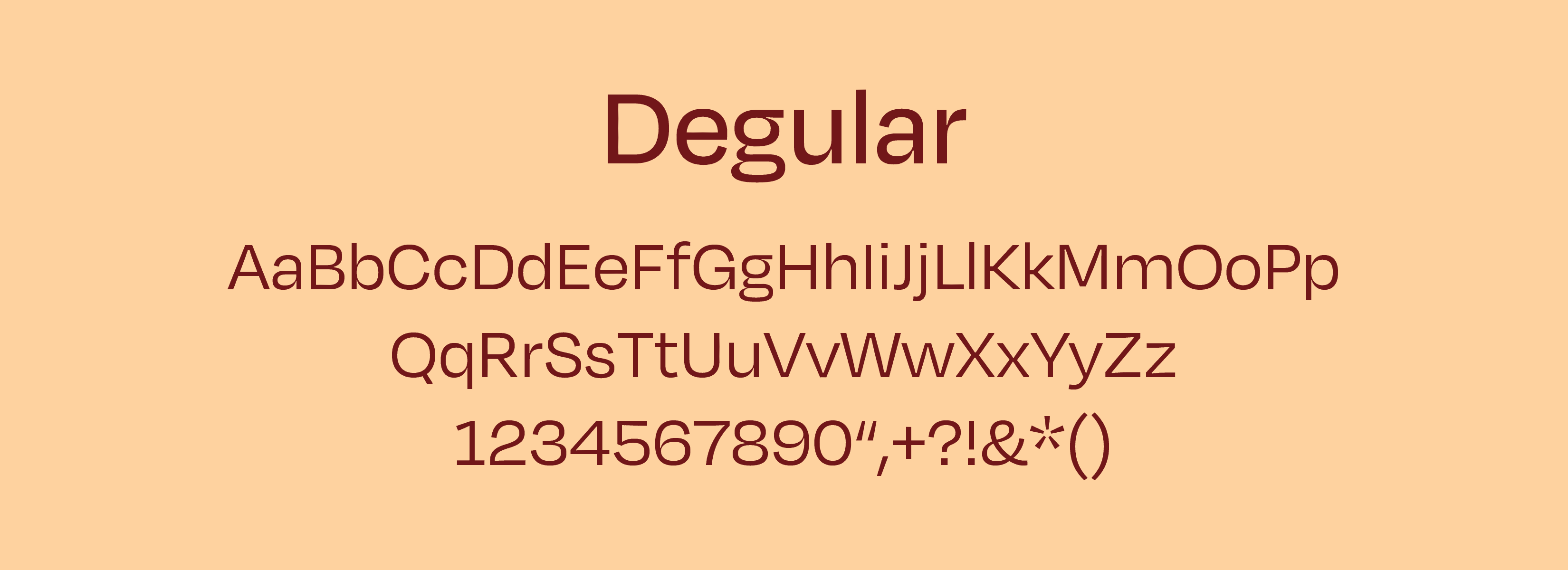
Considering the classical elements already displayed through motifs and patterns, a contrasting balance was achieved through a more simplistic approach on typeface. Emphasizing legibility, the sans-serif Degular font was introduced for body text while Fabiola Capitals with its subtle serifs and thick strokes served as the headings for the opera titles.

Solution
The curtain call.
The final version of The Metropolitan Opera event poster marries text and illustration into a seamless design. To avoid having any one aspect overpower another, all elements were carefully placed so that the final poster communicates a whole picture as opposed to a patchwork of smaller components. With such prestige that The Metropolitan Opera embodies, the color and pictorial treatments become an extension to that same narrative.

More Works
©2026


2025
The Metropolitan Opera
An event poster design for The Metropolitan Opera.
Layout Design
Illustration
Problem
A combination of typography and complimentary illustrations to create a poster that emphasizes clarity and visual interest.
Bellissimo!
This project serves as an experimental venture in type-based poster design. While visual language is important in capturing the viewer's attention, an added layer of text signals that the poster must also present itself with clarity. To achieve this not only requires a defined grid system but an eye for typographic treatment and text hierarchy.
Concept
The Metropolitan Opera invites audiences to experience eight different opera performances for the 2025-2026 winter and spring season.
To best guide the viewer's eyes towards which aspects of text is most notable, a level of hierarchy must be established. Keeping the design locked in a grid system not only works to organize information, but creates a level of order that allows its contents to be understood. By prioritizing opera and composer titles followed by a brief synopsis and performance dates, the viewer is presented with the choice to further examine the poster contents if interested.
Design System
Considering the classical elements already displayed through motifs and patterns, a contrasting balance was achieved through a more simplistic approach on typeface. Emphasizing legibility, the sans-serif Degular font was introduced for body text while Fabiola Capitals with its subtle serifs and thick strokes served as the headings for the opera titles.
Solution
The curtain call.
The final version of The Metropolitan Opera event poster marries text and illustration into a seamless design. To avoid having any one aspect overpower another, all elements were carefully placed so that the final poster communicates a whole picture as opposed to a patchwork of smaller components. With such prestige that The Metropolitan Opera embodies, the color and pictorial treatments become an extension to that same narrative.
More Works
©2026